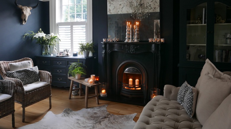
Cottage Goth colour is not simply black paint. The most useful palette comes from things that already belong around old cottages: leaves, bark, soot, wine, brick, bruised fruit, earth, smoke and old cream plaster.
The important part is what the colour sits beside. Deep green next to oak and brass feels very different from the same green beside black laminate and cool white LEDs.
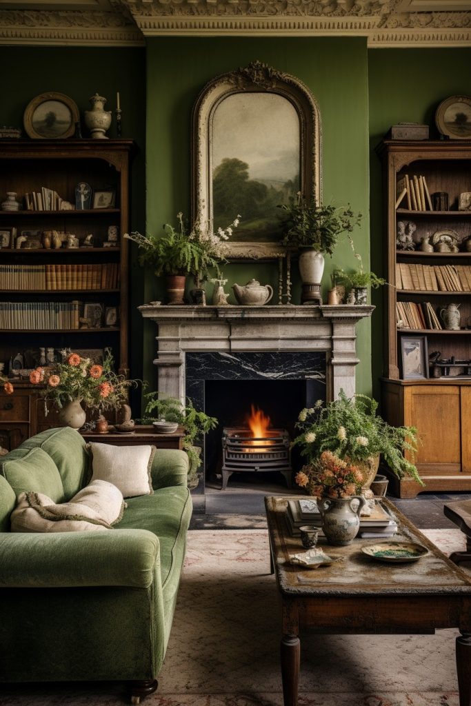
Forest and bottle greens are the obvious starting point
Deep greens are popular for good reason. They can read almost black in weak light while still carrying colour in daylight.
Inigo's Gloucester Road uses Farrow & Ball Studio Green in a sitting room with parquet and a wood burner. Harrow Road uses deep green in both living room and principal bedroom. Ralph Cottage uses Little Greene Dark Brunswick Green in a bathroom.
Those rooms work because the green is not alone: timber, fire, white sanitaryware, windows, metal and pattern give it contrast.
Oxblood and deep red bring warmth
Aubrey Cottage uses a deep red snug with dark-stained floorboards and an original fireplace. Ralph Cottage uses Tuscan Red on its staircase.

Deep red can make a small room feel enclosed in a good way, especially beside timber, old pictures and warm light. It is stronger than using red only as a cushion colour, but less predictable than green, so sample it generously.
Burgundy and oxblood also work well in upholstery if painting the walls red feels too much.
Aubergine and plum sit between red and black
Aubergine is useful where green feels too expected. In low light it becomes deep and neutral; in stronger light the purple becomes more visible.

It pairs particularly well with brown timber, dirty pink, old brass and cream. Avoid pushing every accessory toward purple as well. One large field of aubergine is usually enough.
Soot blue can be quieter than black
Very dark blue gives shadow without the hard graphic quality of true black. It works well with warm wood, rust, faded red and off-white.

In a north-facing room it can become cold, so test it at the darkest time of day. A colour that looks beautifully smoky on a sample card can become flat grey-blue once it covers four walls.
Brown-black is underrated
Very dark brown often feels softer beside timber than a neutral black does. It echoes beams, floorboards, leather and old furniture instead of competing with them.
Use it for panelling, joinery, a chimney breast or a small room where the natural materials are warm. Under amber lamplight it can be almost impossible to distinguish from black, which is often exactly the point.
Warm off-white is part of the palette
Cream, mushroom, old plaster and dirty white are not the opposite of Cottage Goth. They make the dark colours visible.

A pale ceiling can lift a low room. Warm plaster beside a dark beam exaggerates the timber. Cream bedding against green walls creates more depth than dark bedding against equally dark walls.
Those pale notes preserve contrast between the darker colours.
Paint the woodwork deliberately
Matching walls, skirting and doors can make a small room feel calmer because the boundaries disappear. Contrasting trim can emphasise old proportions, panelling and window reveals.
Neither is automatically more period-correct or more Gothic. Look at the architecture. If the room has beautiful old mouldings, contrast may be worth keeping. If it is a simple modern box, colour-drenching can make it feel more enveloping.
Test large patches in several places
Paint at least a generous piece of card or lining paper and move it around the room. Look at it beside the floor, at the window, behind the sofa and under the evening lamps.
Small chips hide undertones. Large samples reveal them.
Do not choose a dark paint only under bright showroom lighting and expect it to behave the same way in a low cottage room.
Let existing materials choose for you
If the room has honey-coloured pine, red brick, grey stone, dark oak or terracotta tile, start there.
A deep colour is successful when those fixed materials look richer beside it. That is more useful than chasing a named aesthetic palette from the internet.
Sources and further looking
- Inigo: Gloucester Road — Studio Green sitting room and strong contrasting joinery.
- Inigo: Ralph Cottage — Tuscan Red and Dark Brunswick Green.
- Inigo: Aubrey Cottage — deep red snug and dark-stained floorboards.
- Cottage Goth lighting — because dark colour changes completely after sunset.